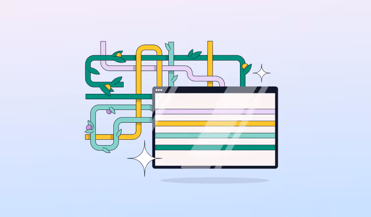
Microservices Visualization: The Secret Ingredient in Effective Microservices Management
Learn how to transform abstract entities into actionable insights with microservices visualization. Explore key features of good microservices visualizations.


Until you can visualize microservices, microservices are a bit like all those random people you’ve gotten to know on the Internet over time - abstract entities with whom you're vaguely familiar, but which you probably don't truly understand. That guy from the Philippines who’s become your Warzone 2 buddy. That Redditor who says she’s a spy but might just be another online LARPer. Unless you meet and get to know these people in real life, you’ll never really know.
Now, microservices aren't people, and they can't lie to you online about their identities. Still, understanding how a microservices architecture actually works can be a real challenge if the only engagement you have with your microservices comes in the form of version control systems, YAML code and kubectl commands.
But with microservice visualization, your microservices assume a whole new level of meaning. Microservice visualization provides critical insights into microservice behavior that you can't get from code alone – or, for that matter, from monitoring tools that visualize the status of your application as a whole, but don't offer visualizations linked to specific microservices or associated metrics.
Let's unpack what microservice visualization means, why it's important, and how to visualize your microservices like a pro.
What is Microservices Visualization?
Microservices visualization is the creation of graphical representations of microservices. In other words, microservices visualization means using charts, graphs or other visual resources to display how microservices relate to each other. Visualizations can also display contextual information, such as metrics about the performance of microservices, or metadata like which node or Pod inside a Kubernetes cluster is hosting a given microservice.
By providing this information, visualizations make it easier for developers and IT admins to understand the state of microservices apps, as well as to detect and investigate problems. For example, a topology map that visualizes relationships between microservices allows engineers to determine at a glance how one microservice relates to another. In the event that a microservice were to fail, the map can help admins quickly identify which interdependent microservices might be affected.
Types of Microservice Visualizations
There are many ways to visualize microservices. Here's a look at some of the most popular methods.
Topology Maps
Topology maps, which are probably the most common type of microservice visualization, display relationships between microservices using a visual map of lines. Thus, they can function as a service map of dependencies between microservices. They can also be organized such that different types of microservices – such as those that help run an app's frontend and those that run the backend – appear in different parts of the visualization, helping admins to recognize which app functionality corresponds to which microservices.
.png)
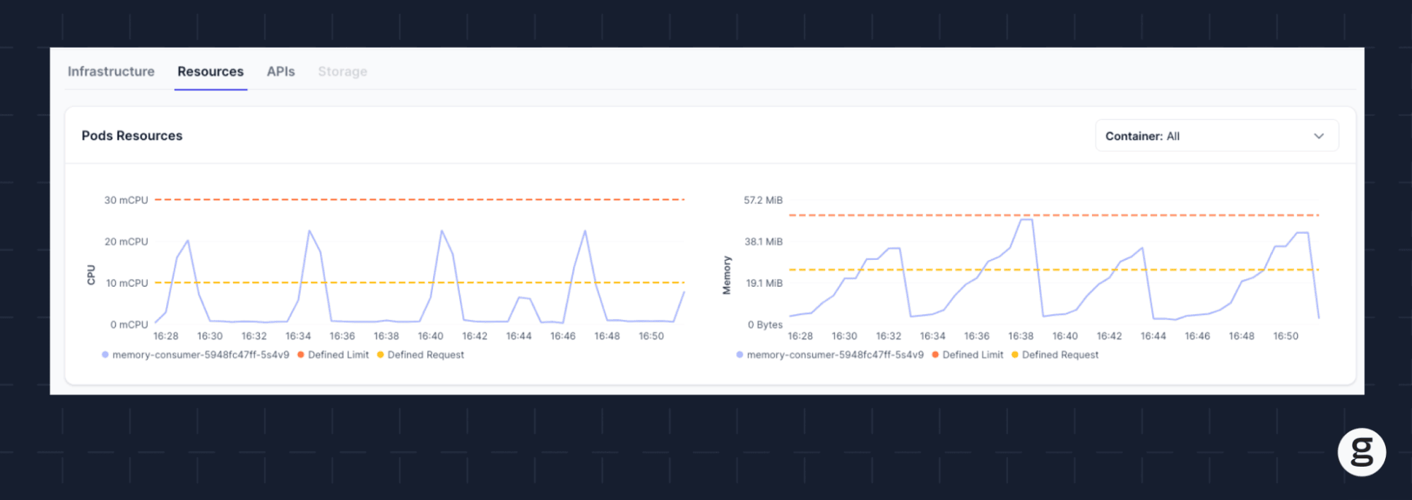
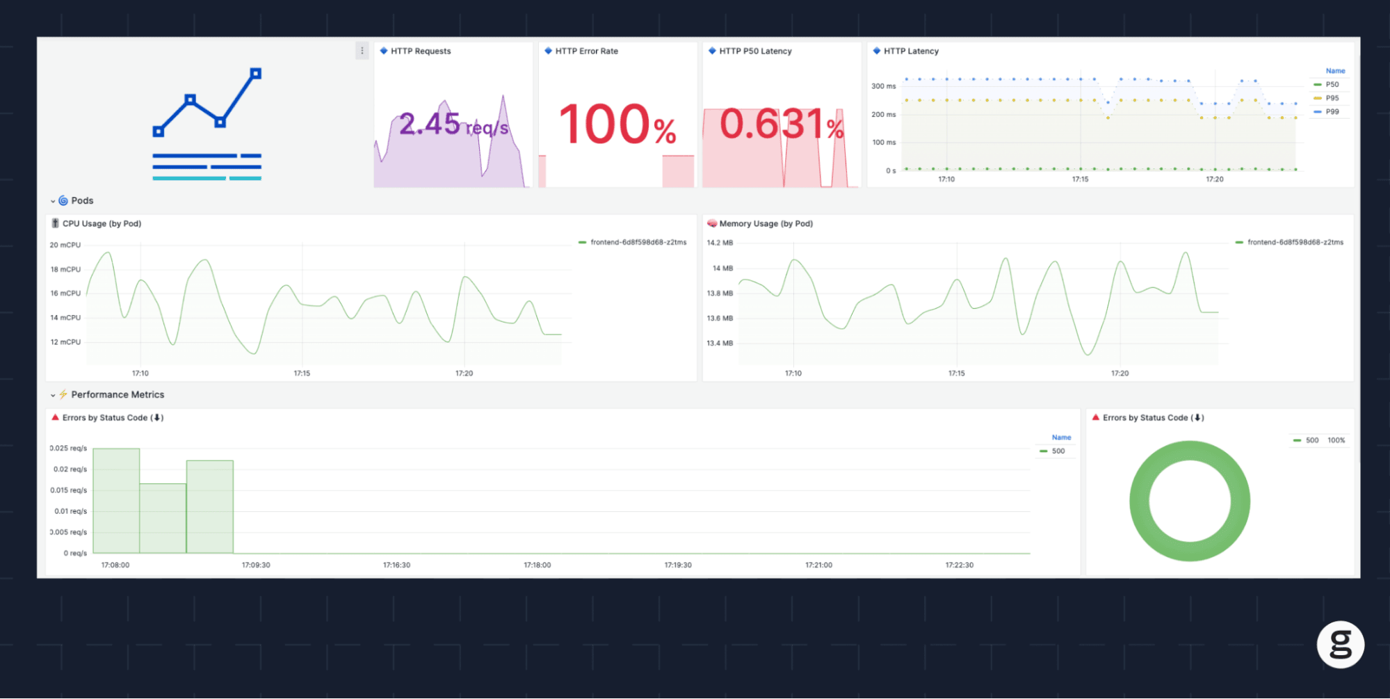
Time-Series Graphs
If you want to visualize the performance of a microservice or set of microservices over time, you can use a time-series graph. Time-series graphs can display performance data relative to different points in time, helping to visualize trends like how much memory or CPU a given microservice has consumed over time. If desired, you can display data for multiple microservices on the same time-series graph, which would be useful if you wanted to know how performance trends for different microservices compare to each other.
Cartogram
A cartogram is a type of visualization where the size at which data is displayed corresponds to some characteristic of that data. When used to visualize microservices, cartograms can show information such as how many microservices are running on each node in a Kubernetes cluster (in which case, nodes hosting more microservices would appear larger on the visualization) or how much memory each microservice is using (meaning microservices using more memory would appear larger). Cartograms are useful as a way of creating clear imbalances between different types of microservices.
The Need for Microservices Visualization
Strictly speaking, no one has to visualize microservices. You can deploy microservices, and even perform basic monitoring and observability tasks, without the help of visualizations.
However, if you took that approach, you'd likely struggle to manage microservices efficiently because your insights into how your microservices architecture is structured, and how your microservices are behaving, would be limited to textual data. You could run commands like kubectl top pod to collect some basic metrics about the resource utilization of each Pod, which – if you know which Pods correspond to which microservices – would allow you to monitor the resource consumption of each microservice. Or, you could look at application logs to monitor changes in request rates and errors.
But that strategy doesn't work well at scale. In a typical microservices app, where you might have dozens of microservices running across a larger number of Pods and nodes, text-based insights into the status of every microservice take too long to collect and interpret. You may spend hours poring over command-line output or log files before you detect an issue that would be obvious in seconds with the help of a visualization.
Microservice visualization solves this challenge by delivering key insights, which in turn improves both the efficiency and effectiveness of monitoring and observability in multiple ways.
Better System Understanding
For one, visualizations enable better understanding of a complex microservice system and microservices architectures. Typically, there is no command you can run to determine how one microservice interacts with other microservices inside an app, or what would happen to one microservice if another microservice experienced a performance issue. Without visualizations, the best you can do would be to pore over the source code for each microservice, or possibly monitor API transactions, in an attempt to figure out where each microservice fits within the system of which it is a part.
With a visualization such as a topology map of your microservices, however, you can see at a glance how all of the microservices in an app connect. This insight is invaluable not only for troubleshooting problems that involve more than one microservice, but also for tasks like assigning resource quotas (because understanding dependencies helps you know how to balance resources between microservices) or adding new microservices to an app (in which case you can reference a topology map to understand where a new microservice would fit into the app's microservice architecture.
Error Detection and Management
Anomalies that can't be explained by a deliberate change are often the first sign of errors or other problems in a microservices app. With the help of visualizations, admins can recognize many anomalies in seconds.
For instance, if you have a time-series graph that shows resource consumption levels over time, you'd easily be able to see a sudden spike or dip in the resource consumption of a microservice because the line on the chart that represents resource utilization would veer sharply up or down. Unless you performed an action (like changing a container's resource quota) that explains the change, you'd know that you should investigate.
It would be much harder to gain this type of insight using text-based analysis alone. To do that, you'd have to collect metrics or error data by hand, then look at it side-by-side in a bid to detect anomalies – a process that would take a large amount of time, and that would also likely leave you struggling to detect errors in a system where you have dozens of microservices, each producing a continuous stream of metrics.
Key Capabilities of Good Microservices Visualization
As we mentioned above, there are many different ways to go about visualizing a microservices architecture, and there is no one-size-fits-all approach. However, as you plan a visualization strategy, you should ensure that the types of visualizations you choose enable all of the following key capabilities.
Collaboration
Good visualizations enable not just individuals, but collective teams, to understand and collaborate around data. To this end, a visualization should display types of information that are relevant to different stakeholders.
For instance, developers might want to see data about when a microservice was last updated, whereas IT admins will want to see resource utilization metrics. By showing these elements concurrently, a visualization makes it easy for both groups to collaborate around microservice performance.
Intuitive Insights
Visualizations should never leave viewers guessing. Understanding what they are showing should be as intuitive as possible. For this reason, steer clear of unnecessary jargon or extraneous data when creating microservice visualizations.
Change Management Capabilities
Sometimes, the purpose of a visualization is not to monitor real-time status, but to help plan or manage a change, such as the deployment of a new version of a microservice.
Time-series visualizations that show data from both before and after the implementation of a change are useful for this purpose. They allow admins to validate that a change did not lead to unexpected problems, such as an increase in errors.
Discrepancy Detection
Again, anomalies are often the first sign of a performance issue. The easier visualizations make it to detect a change from the norm, the more valuable they are in highlighting discrepancies quickly enough for admins to take action.
Visualizations that display real-time data relative to a historic baseline are useful for this purpose. So are those that use special effects, such as different colors, to highlight data that falls outside the scope of expected values.
Visualizing Microservices with groundcover
When it comes to analyzing and visualizing microservices, groundcover delivers two killer features.
One is the ability to collect microservices data using eBPF, which is massively more efficient than relying on conventional collection methods. This means groundcover can collect more data with less resource overhead than conventional monitoring and observability tools.
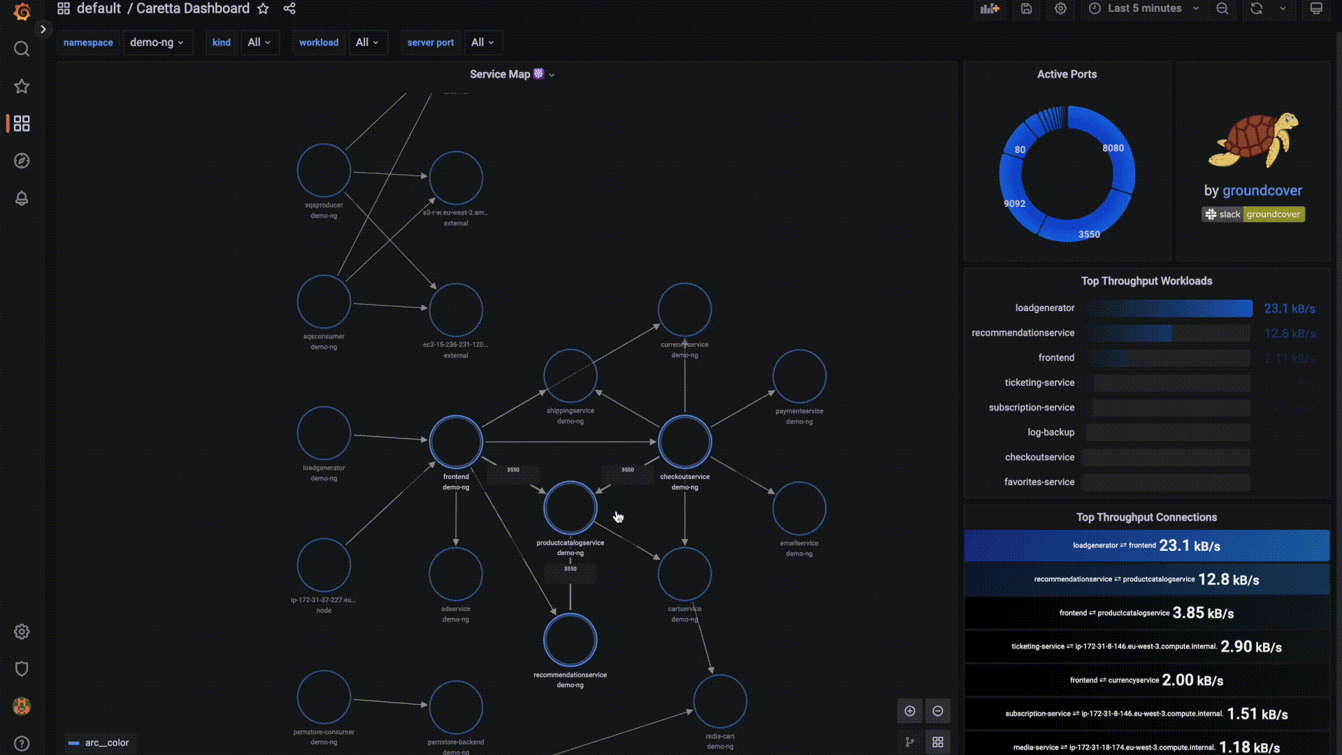
The second is powerful built-in visualization tools – and we're not talking just about basic graphs and charts. At groundcover, we've built a new generation of tooling – such as Caretta, a visualization tool that displays a service map of dependencies – from the ground up and integrated them into our product. You can also create custom dashboards and Grafana visualizations using PromQ, and you have total control over which data drives your visualizations.
Whichever microservices data you want to visualize, and however you want to visualize it, groundcover lets you do it in a hyper-efficient, scalable way.
Visualizations: A Key Element
You can't manage very well what you can't see – which is why visualizations are one key element of microservices monitoring and observability. Visualizations can dramatically reduce the time and effort necessary to detect important trends or error events in a complex software architecture consisting of loosely coupled microservices. They also make it easier to understand the nature and state of the app as a whole.
Whether you're struggling to monitor microservices effectively and need some help, or are already a microservices observability pro but want to take your strategy to the next level, visualizations can help you tame even the most complex microservices app.


.svg)