Grafana Dashboards: Key Features, Challenges & Best Practices

When your application slows down or a system metric deviates from its normal range, you need a way to identify the issue before users experience the impact. Grafana dashboards provide that visibility. They transform performance data into visual panels that help you trace issues, compare trends, and understand system behavior as it changes.
Instead of scanning through log files or switching between monitoring tools, you can use Grafana dashboards to track live metrics from multiple sources in one view. This visibility helps spot issues faster and focus on what matters instead of guessing where the problem lies. This article will cover the core features of Grafana dashboards, the challenges you might face when scaling them, and the best practices for building dashboards that deliver lasting value.
What Are Grafana Dashboards and Why Are They Used?
Grafana dashboards are visual interfaces that monitor and display system performance in real time. They bring together three main types of observability data: metrics, logs, and traces, as shown below:
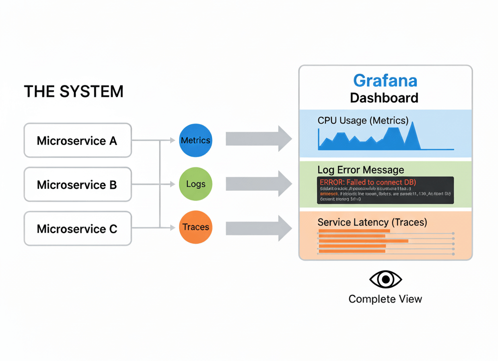
Metrics show numerical values such as CPU usage or latency over time. Logs record detailed events, including user actions and errors. Traces show how a single request moves through different services in a distributed system. When viewed together, these data types give a complete view of how your system behaves.
Each dashboard is defined by a JSON model that specifies the layout, data sources, and variables. You can edit or share this configuration across environments without losing consistency. To gather and display monitoring data, Grafana utilizes plugins to connect to data sources such as Prometheus, Loki, and Elasticsearch.
Key Features That Make Grafana Dashboards Powerful
Grafana dashboards are more than collections of charts. Their strength comes from features that make complex monitoring data easier to work with and interpret. These features help you customize dashboards to match your environment and respond quickly when something changes.
1. Panels
Panels form the base of a Grafana dashboard. Each panel displays data in a visual format such as a graph, table, or gauge. You can connect different panels to different data sources, allowing you to monitor several metrics at once. For instance, one panel can show CPU usage while another tracks memory consumption or network latency.
2. Variables and Templating
Variables make dashboards adaptable. You can create filters to switch between clusters, environments, or regions without editing queries. This is useful when you monitor multiple systems and want a consistent layout across them.
3. Alerting
Grafana’s alerting feature notifies you when metrics move beyond expected values. You can set rules to trigger alerts and deliver them through tools like Slack, email, or PagerDuty. This way, you stay informed even when you’re not actively viewing the dashboard.
4. Annotations
Annotations add context to your graphs. They mark moments such as deployments or incidents, making it easier to connect changes in performance with specific events.
5. Plugins and Data Source Integrations
Grafana supports many data sources through plugins, including Prometheus, Loki, and Elasticsearch. These integrations let you bring metrics, logs, and traces into one view, helping you see how different parts of your system relate to each other.
These features help move from raw data to insight, ensuring systems stay reliable and easy to understand.
How to Create a Grafana Dashboard: Step-by-Step
Before building dashboards, you need a running Grafana instance. You can use Grafana Cloud for a hosted setup or install Grafana locally for full control. For Grafana Cloud, create an account here and log in to access your workspace. For a local setup, download Grafana from the official site, then follow these installation instructions for your operating system. Once it is installed, start the service, and open http://localhost:3000 in your browser to access the Grafana dashboard. The default username and password are both admin.

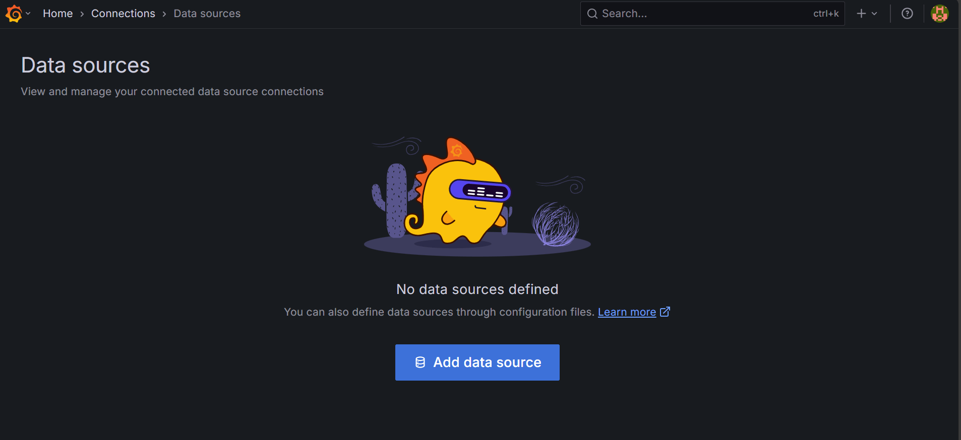
Once your Grafana instance is ready, the next step is to connect it to a data source.
Connecting a Data Source
To display metrics in your dashboard, you can use Prometheus or any other supported data source. For this example, you will connect Grafana to the public Prometheus demo endpoint to access live time-series metrics without setting up a local Prometheus server. Later, you can replicate the same steps for any data source in your environment, including Loki for logs or Tempo for traces.
To add the Prometheus data source, navigate to Connections → Data sources → Add data source.
Then, select Prometheus, enter a name such as prometheus-promlabs-demo, and set the URL to the demo endpoint.

You don't need authentication or TLS adjustments since it is a public server. But for other production servers, you may need to configure them to meet security requirements. Proceed to the bottom of the page and click Save & Test to verify the connection.

Once successful, your next step is to create a dashboard.
Creating a New Dashboard
From the data source page, click Build a dashboard, or navigate to Dashboards → New → New dashboard.
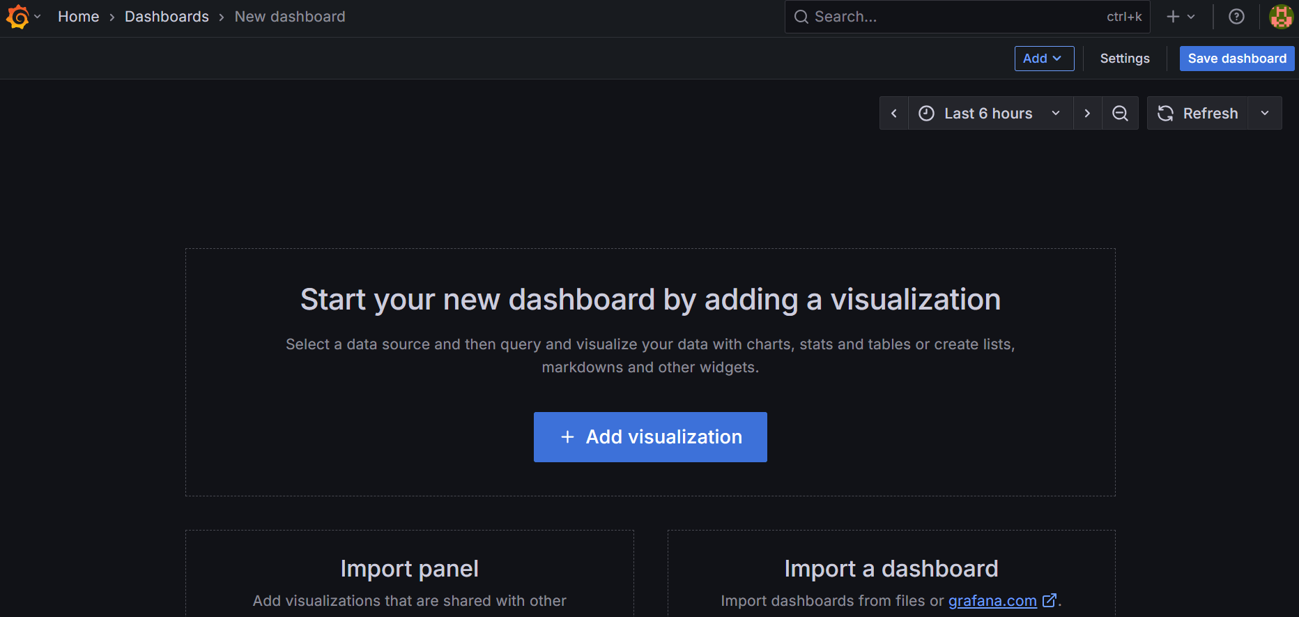
On the blank dashboard, click Add visualization. Then, select Prometheus as your data source.
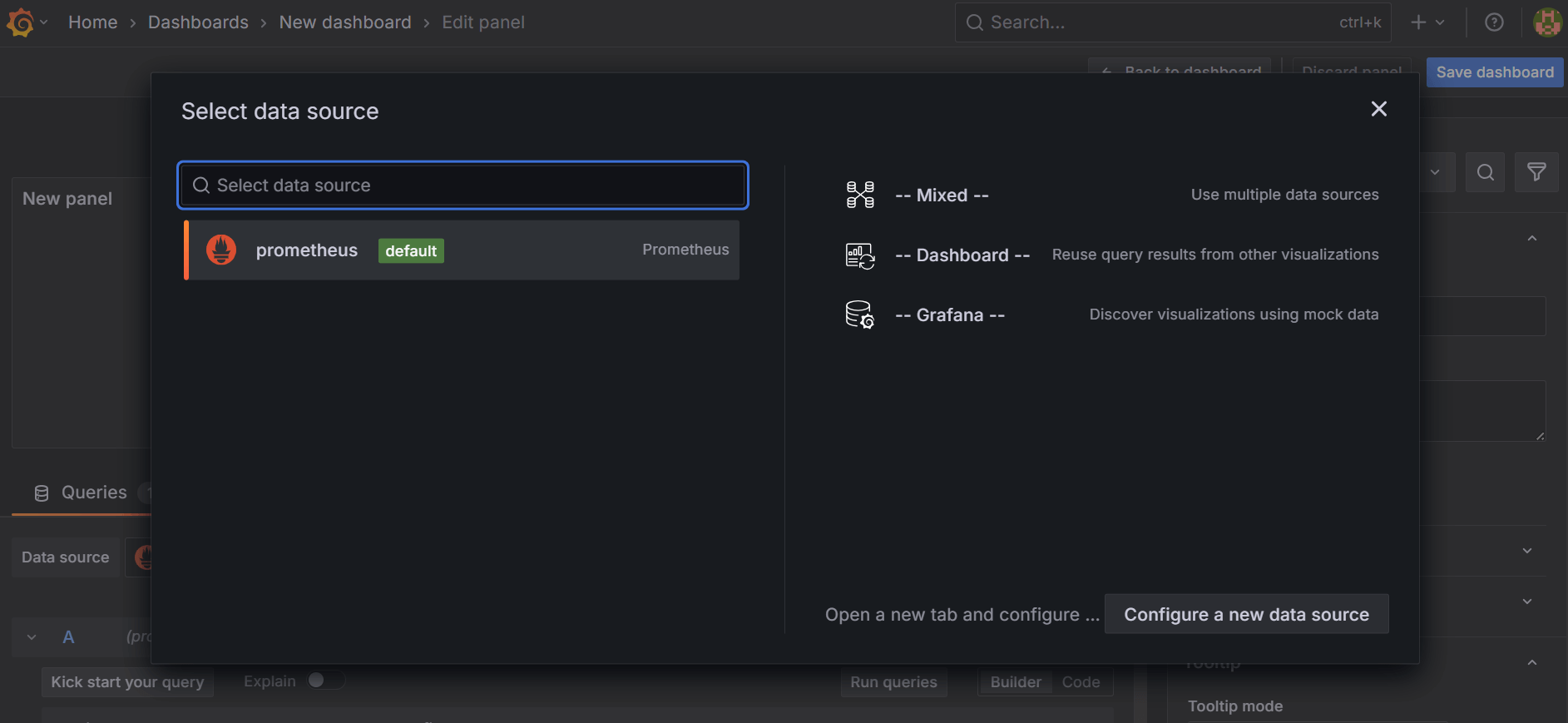
Selecting the data source will open a panel editor.
Configuring Panels and Queries
In the panel editor, switch to Code mode in the query editor to write PromQL directly. Enter the following query:
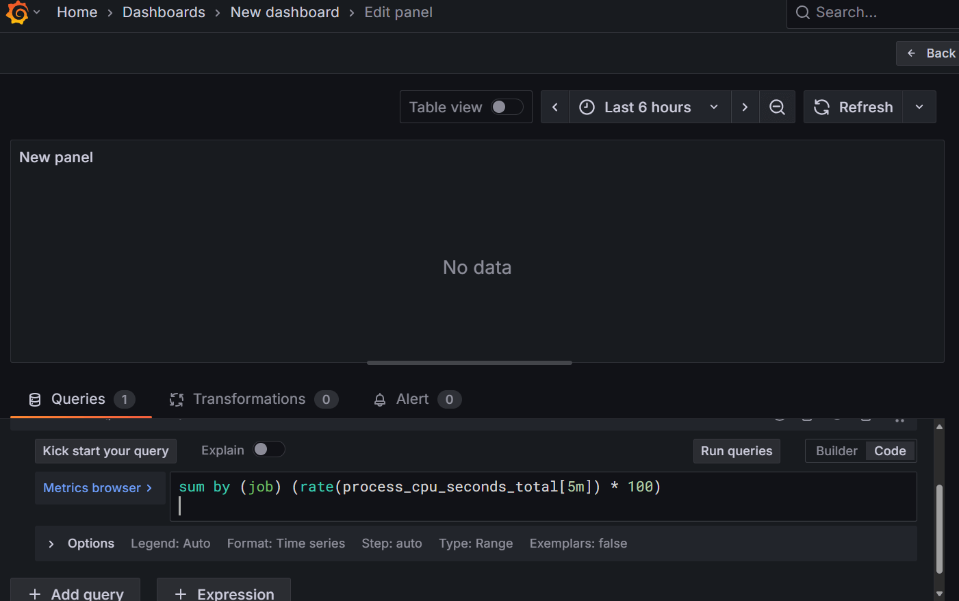
This query calculates CPU usage per job as a percentage over the last five minutes. The metric process_cpu_seconds_total tracks the cumulative CPU time for each process. Applying rate(...[5m]) converts the counter to a per-second value over the window, and multiplying by 100 produces a percent-like figure. Grouping by job ensures each series corresponds to a specific job, making it suitable for multiple gauge panels.
Visualization and Panel Settings
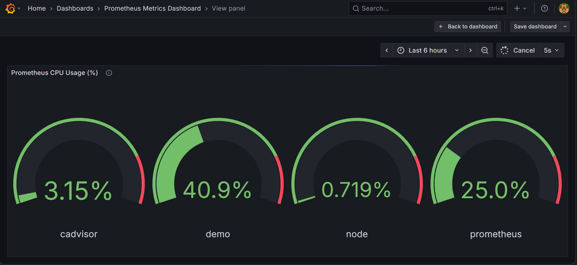
On the panel settings on the right side of the page, choose Gauge as the visualization type. Then, set the panel title to Prometheus CPU Usage (%), with a unit of Percent, a minimum of 0, and a maximum of 100. Also, set thresholds, such as green below 80 and red above 80, to help highlight critical values. Finally, show only the last value of each series, and set auto-refresh to five seconds for near real-time updates. If everything is set correctly, your panel will appear like this:

Each gauge panel shows the job name from Prometheus and its CPU usage.
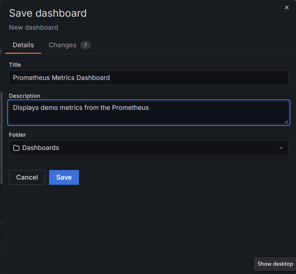
Saving and Reviewing the Dashboard
After configuring the panels, save the dashboard as Prometheus Metrics Dashboard. Also, add a description of your choice.
The resulting dashboard with a single panel looks like this:
You can add more panels to this dashboard to visualize more metrics.
Customization Options for Grafana Dashboards
Grafana dashboards provide many ways to adapt the interface to your monitoring needs. This customization helps make observability data easier to interpret and ensures your dashboards reflect the systems you monitor. Some of these options are:
Theme Selection
The theme controls the overall appearance of the dashboard. To change it, click your profile avatar at the top right and select Change theme.

Options include Dark, Light, System preference, and other experimental themes. Select a theme of your choice to adjust colors across all panels and menus. These options are aimed at helping you choose a theme you are comfortable using during long monitoring sessions.
Variables and Templating
Variables let dashboards be dynamic by acting as filters for your observability data. They allow you to switch between environments, jobs, or other dimensions without rewriting queries. To manage variables, click the Settings icon in the top-right dashboard menu and select Variables in the opened page.

You can add new variables or modify existing ones. To create variables for your Prometheus Metrics Dashboard, click New variable. Then, in the page that opens, configure the variable with Name set to job, Type as Query, Data source as your Prometheus source, and Query as label_values(job). Leave other settings at defaults and click Save.
Once the variable is added, update your panel query to reference it. For example, your CPU usage query would be:
After saving the panel and dashboard, a dropdown appears at the top of your dashboard.

You can now select the job you want to view.
Panel Customization
Panels can display graphs, gauges, tables, or other visual formats. To edit a panel, hover over it, click the title dropdown, and select Edit. In the editor, you can adjust the visualization type as you did earlier, colors, thresholds, legends, units, background transparency, etc. This ensures that each panel communicates the data clearly and aligns with your monitoring goals.
Combining these customization options creates dashboards that are clear, flexible, and tailored to the observability data you track.
Advanced Grafana Dashboard Features
Beyond basic panels and variables, Grafana provides advanced features that help gain deeper insights from observability data. These features give you more control over how data is displayed, filtered, and interpreted.
Dashboard Links and Navigation
Advanced dashboards often include links to other dashboards or external resources. These links let you drill down into specific systems, clusters, or services without leaving the Grafana interface. You can add links by navigating to dashboard settings → Links and specifying the destination dashboard or URL, along with optional variables to pass context.
Repeating Panels and Rows
When monitoring multiple instances or services, repeating panels and rows allow a single panel configuration to display multiple times automatically. You can configure a panel to repeat for every value of a variable, such as different jobs, servers, or clusters. This avoids duplicating panels manually and ensures consistency across similar metrics.
Advanced Query Options
Grafana’s query editors support advanced filtering, aggregation, and transformations on observability data. For example, Prometheus queries can include rate(), sum by(), or other functions to calculate derived metrics. You can also use transformations within Grafana to join, filter, or calculate values across multiple queries, creating richer panels without modifying the data source.
Thresholds and Conditional Formatting
Beyond simple thresholds, you can set conditional formatting rules to highlight critical values dynamically. For instance, color-coding values based on severity or highlighting outliers in tables and graphs makes it easier to spot issues immediately. You can configure these rules per panel under Panel Options → Thresholds.
Dashboards-as-code
You can export dashboards as JSON or YAML and provision them via config files or the API. Store these definitions in version control and apply them with automated workflows so dashboards remain consistent across development, staging, and production.
Scaling Across Teams and Environments
Grafana lets you manage dashboards at enterprise scale by grouping users into teams and assigning permissions at the folder or dashboard level. Teams can sync with external identity providers for automated user management. Grafana also supports template variables and dashboard provisioning. This enables dashboards to be reused across environments like development, staging, and production, ensuring consistency.
These advanced features help enhance the usability and scalability of dashboards.
How to Optimize Performance in Grafana Dashboards
As dashboards grow in complexity, performance can become an issue, especially when pulling large volumes of observability data. Optimizing dashboards ensures fast load times, responsive panels, and efficient resource usage. Here are a few strategies to improve performance:
Reduce Panel Queries
Each panel generates queries to the data source. Too many simultaneous queries can slow down the dashboard. Combine metrics where possible using aggregation functions or transformations, and avoid unnecessary panels that duplicate information.
Use Variables Efficiently
Variables make dashboards flexible, but can increase query load if not used carefully. Limit multi-value selections when querying large datasets, and prefer template queries that return only the necessary labels. Cascading variables can further reduce the amount of data queried at once.
Apply Time Range and Auto-Refresh Wisely
Setting a long default time range or very frequent auto-refresh intervals can overload the dashboard. Choose a time range that balances detail with performance, and set auto-refresh intervals appropriate to the data you are monitoring. For example, a 5–15 second refresh is suitable for near real-time metrics, while logs or traces may need longer intervals.
Transformations and Aggregations
Instead of sending raw data to multiple panels, use Grafana’s built-in transformations to calculate totals, averages, or percentages. Aggregating at the query or panel level reduces the volume of data transferred and rendered, improving responsiveness.
Panel Type Considerations
Complex visualizations like heatmaps or histograms may require more resources than simple gauges or single-stat panels. Use visualization types that convey the necessary information without overloading the dashboard or your browser.
While optimizing performance in Grafana, the aim is to balance detail and responsiveness. This maintains fast, reliable dashboards even as your observability data grows.
Common Challenges with Grafana Dashboards in Modern Environments
While Grafana dashboards provide powerful observability, you may encounter challenges as your monitoring needs grow. Here are a few common issues:
Handling Large Volumes of Observability Data
As the number of metrics, logs, and traces increases, dashboards can slow down. Each panel query adds load, and dashboards with many panels can strain the browser or data source. Optimizing queries, aggregating metrics, and limiting unnecessary panels help maintain performance.
Managing Multi-Cluster or Multi-Environment Setups
Monitoring multiple clusters or environments requires consistent dashboards across instances. Without template variables, dashboard provisioning, or configuration-as-code workflows, maintaining these dashboards can become error-prone and time-consuming.
Maintaining Access Control
In larger teams, ensuring the right users have access to the correct dashboards and folders is critical. Incorrect permissions can lead to unauthorized access or prevent team members from viewing the data they need. Using Grafana’s team and folder permission features helps address this.
Alert Noise and Over-Notification
Improperly configured alerts can create “alert fatigue,” where users receive too many notifications, many of which are not critical. Careful threshold design, grouping similar alerts, and filtering unnecessary notifications are essential to keep alerts actionable.
Dashboard Consistency
Without standardization, dashboards can differ across teams or environments, making comparisons difficult. Using shared templates, variables, and provisioning ensures dashboards are consistent and easier to maintain.
Best Practices for Designing High-Impact Grafana Dashboards
Creating effective Grafana dashboards requires more than adding panels and metrics. Your goal should be to deliver insights quickly, support decision-making, and maintain clarity as data scales. Here are several best practices to achieve that:
- Focus on Key Metrics: Prioritize the metrics that matter most for system performance and business objectives. Avoid overloading the dashboard with redundant or low-value data. This keeps the dashboard focused and easier to interpret.
- Design around key signals: Structure panels to reflect observability frameworks such as RED (Rate, Errors, Duration) and the Four Golden Signals (Latency, Traffic, Errors, Saturation). Place the most important key performance indicators(KPIs) where the eye lands first so anomalies are obvious.
- Use Consistent Layouts and Visualizations: Organize panels logically, grouping related metrics together. Use consistent visualization types for similar data, gauges for percentages, graphs for trends, and tables for detailed lists. Consistency helps users quickly understand the information at a glance.
- Leverage Variables and Templating: Variables allow dynamic filtering across clusters, environments, or services without changing queries manually. Apply template variables thoughtfully to ensure dashboards remain adaptable while keeping query load manageable.
- Apply Annotations and Context: Annotations provide context for events such as deployments, incidents, or configuration changes. Adding them to your panels helps correlate metric changes with real-world events, improving root-cause analysis.
- Optimize for Performance: Monitor dashboard performance and apply optimizations where needed. Reduce excessive panel queries, aggregate metrics when possible, and use appropriate refresh intervals. Efficient dashboards are more responsive and reduce strain on data sources.
- Design for Collaboration: Use folder structures, shared dashboards, and consistent naming conventions to make dashboards accessible across teams. Apply appropriate permissions and document panel purposes to ensure teams can use them effectively.
These practices ensure that Grafana dashboards remain informative, reliable, and scalable, even as your systems and observability data grow.
How to Use Grafana Dashboards for Full-Stack Observability
In complex systems, monitoring a single metric isn’t enough to understand what’s happening. To use Grafana dashboards for full-stack observability, you need to:
Correlate Metrics, Logs, and Traces
Combine metrics, logs, and traces in a single dashboard to connect system behavior with underlying events. For example, a spike in latency can be traced through logs and request paths to quickly identify the service causing the issue.
Monitor Across Services and Infrastructure
Display data from multiple clusters, services, or containers in real time. CPU, memory, network usage, and application-specific metrics can be combined with logs and traces, giving a unified view of system performance.
Customize Views for Teams or Roles
Different teams need different insights. Developers may focus on traces, while operations teams monitor infrastructure metrics. Use variables, templating, and panel filters to tailor dashboards for each team without creating separate dashboards.
Enable Faster Incident Response
With all observability data in one place, detecting anomalies and investigating root causes becomes faster. Integrated alerts allow teams to respond proactively, reducing downtime and improving overall reliability.
Unified Visibility Across Traces, Logs & Metrics in Grafana Dashboards with groundcover
Grafana dashboards require external data sources to visualize observability data. groundcover collects metrics, logs, and traces from your systems and standardizes them, creating a single source of truth across environments.
Here is how groundcover supports unified visibility:
Integration with Grafana
groundcover connects to Grafana and delivers observability data from multiple sources, such as Prometheus, Loki, and OpenTelemetry. This allows dashboards to show different types of data together without manually combining sources.
Automatic Data Collection
Using eBPF technology, groundcover collects information from applications and infrastructure without changing your code. This ensures that metrics, logs, and traces are captured consistently across your environment.
Real-Time Monitoring and Alerts
Data from groundcover updates Grafana panels continuously. You can also set alerts based on this data, helping teams respond quickly when issues arise.
Scaling and Consistency
groundcover standardizes the collected data, so dashboards can be reused across environments like development, staging, and production. With Grafana variables and templating, teams can filter data by service or cluster while keeping dashboards consistent. This setup supports multiple teams and systems without adding complexity.
Combining Grafana with groundcover helps you see all observability data in one place. It also helps track system performance and reduce the effort required to manage multiple sources.
Embedded Grafana Dashboards: Bringing Observability Directly Into groundcover
When you use groundcover, Grafana dashboards aren’t just an external add-on, they’re embedded directly within the platform’s UI. This enables teams to leverage all the visualization power of Grafana while keeping monitoring, alerts, and observability data unified in one place.
In groundcover, with embedded Grafana dashboards, you can:
- Access your existing Grafana dashboards and alerts natively inside groundcover
- Build new panels and visualizations without leaving the groundcover environment
- Use existing Prometheus, ClickHouse, or OpenTelemetry data as data sources
- Maintain the same query language (PromQL) and visualization experience developers already know
This integrated setup helps teams streamline observability workflows, reduce context switching, and ensure consistency across environments.
Key Takeaways Why Embedded Grafana Dashboards Matter
- Single-pane visibility – Embedding Grafana inside groundcover eliminates tool-switching. You can visualize metrics, logs, and traces from Prometheus and ClickHouse directly in one unified view.
- Faster setup, zero migration pain – Existing Grafana dashboards can be imported instantly, preserving your queries, panels, and alerts without reconfiguration.
- BYOC flexibility – Whether your Grafana instance is managed by groundcover or self-hosted, you can expose the same secure Prometheus and ClickHouse data sources through API keys.
- Infrastructure-as-code for observability – Manage dashboards and alerts as code with the Grafana Terraform provider. Version, review, and deploy dashboards the same way you deploy infrastructure.
- Cross-environment consistency – Embedded Grafana ensures dashboards and alerts stay synchronized across clusters, environments, and teams — reducing drift and duplication.
- Lower operational overhead – No need to maintain a separate Grafana stack; the embedded instance is fully managed and integrated with groundcover’s observability pipeline.
By embedding Grafana within groundcover, teams get the best of both worlds — the customization and visualization of Grafana, combined with the scalability and unified data of groundcover.
FAQS
How should an incident-focused dashboard be laid out?
Place the most important signals at the top, such as latency, error rate, request rate, and resource usage, so issues are easy to spot. Use a middle row that repeats for each service or job, using a variable to avoid creating duplicate panels. Keep logs and traces at the bottom for quick investigation, and add deployment markers to match metric changes with releases.
How can alert noise be reduced?
Focus alerts on user-impact metrics like latency and errors instead of every small change. Use two burn-rate windows to detect both short spikes and slow trends. Send only urgent alerts to paging systems and route less critical ones to chat. Add maintenance windows and grouping rules to avoid duplicate or expected alerts.
How can dashboard performance stay fast at scale?
Precompute heavy queries with recording rules and avoid wide filters that return too many series. Focus on top-k or aggregated views instead of full data. Downsample for long time ranges, limit data points per panel, and refresh only frequently changing metrics to keep dashboards fast.
Conclusion
Grafana dashboards help you see system performance clearly by bringing observability data together in one place. By using a tool like groundcover to collect metrics, logs, and traces, you can ensure that your dashboards always reflect accurate and up-to-date information. This allows you to monitor the full stack, explore different services or environments easily, and respond to issues more quickly without adding extra complexity.


.svg)