Everything New in groundcover Dashboards: August 2026
A roundup of everything new in groundcover Dashboards this quarter: thresholds, tree maps, gcQL, and more, all built for agents and humans alike.

We've been paying close attention to our customers and how they use dashboards day-to-day, and our team has been hard at work building in response. Every feature below either makes a dashboard something an agent can build well, or makes it something a human can trust and act on fast.
Here are some highlights of all that’s new below:
Sketch it, and the agent builds it
Take a photo of a whiteboard sketch, a mockup from any sketching tool, or even the back of a napkin sketch from a happy hour turned brainstorming session, and upload it to groundcover. The agent reads the sketch and builds a working dashboard from it. No blank canvas, no starting from a template that is almost right.
This is the clearest version of the whole thesis behind this release: agents don't kill dashboards, they make them easier to build. You don't need to know gcQL or the widget library to start. You just need an idea (and something to draw it on).
Visualization
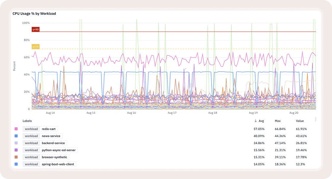
Threshold visualizations
Reference lines or bands, severity coloring (Error, Warning, OK, Info), solid or dashed, up to ten per widget. This was the most requested primitive from teams running SLOs.
Tree maps
Hierarchical share of total across a lot of categories at once. Built for the "where is volume, cost, or error concentrating" question, which a line chart just isn't the right shape for.
Conditional formatting on stat tiles
Comparison and range rules, up to ten per widget, first match wins. Turns a tile from "here's a number" into "here's a number, and here's whether you should care."
Y-axis controls
Scale, min and max, always include zero, log scale, decimal precision, metric formatting. Small on their own, but this is the difference between a chart that's technically correct and one that doesn't quietly mislead you.
Multi query and formula widgets, plus time offset
Combine queries with arithmetic, overlay this week against last week on one chart. Comparison used to mean two dashboards side by side. Now it's one chart.
Built for scale, not just for one dashboard
Search and tagging
By name, tag, owner, description, and pullable by tag straight from Slack. Findability at scale.
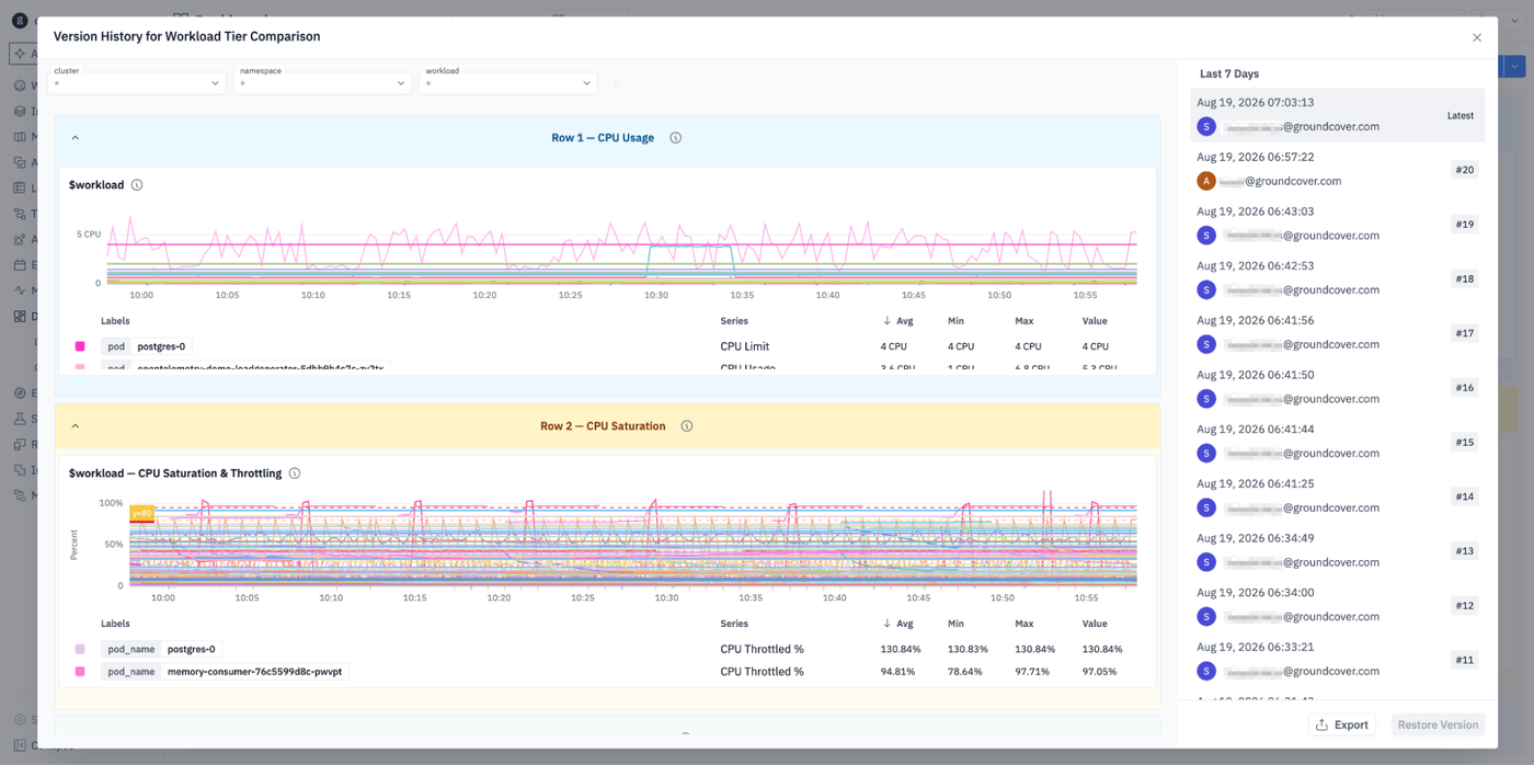
Version history with revert
No recovery path used to mean an overwritten dashboard was just gone - not anymore.
Archive and restore, plus a stale version notice
Protects against silent overwrites when two people are editing at the same time.
Cross source variable mapping
One variable, many sources, no duplicate dashboards. Anais covers this in depth in her post, so I'll leave it there rather than re-explain it.
Sharing that means something
Widget level share links
The link scrolls to and highlights the specific widget, not just the board. A link to a fifty widget dashboard never used to say which one you meant - now it does.
Dashboard PDF and widget PNG export
For the exec review that happens outside the platform, because that review is always going to happen outside the platform.
Synced crosshair across time series widgets
Correlate multiple charts by eye without hovering each one separately.
Dashboard Catalog
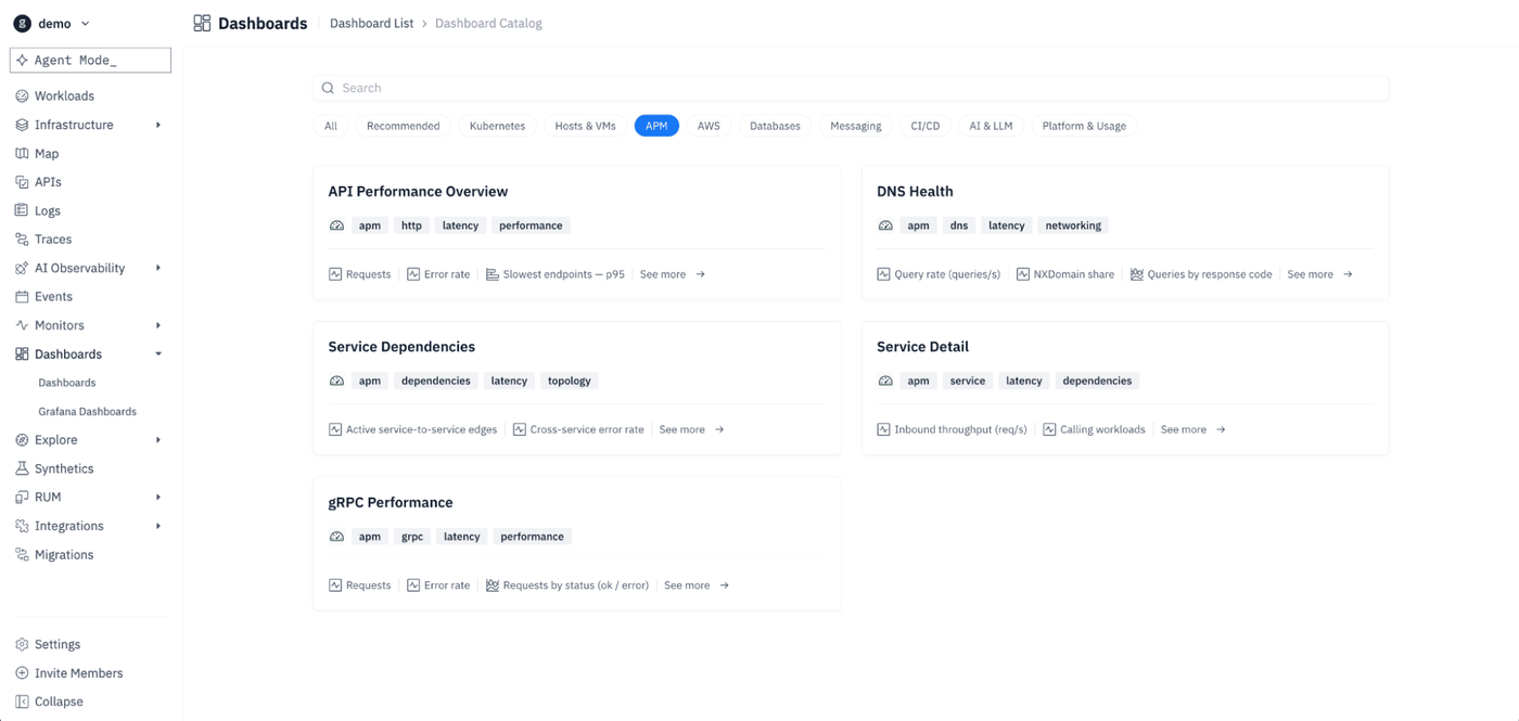
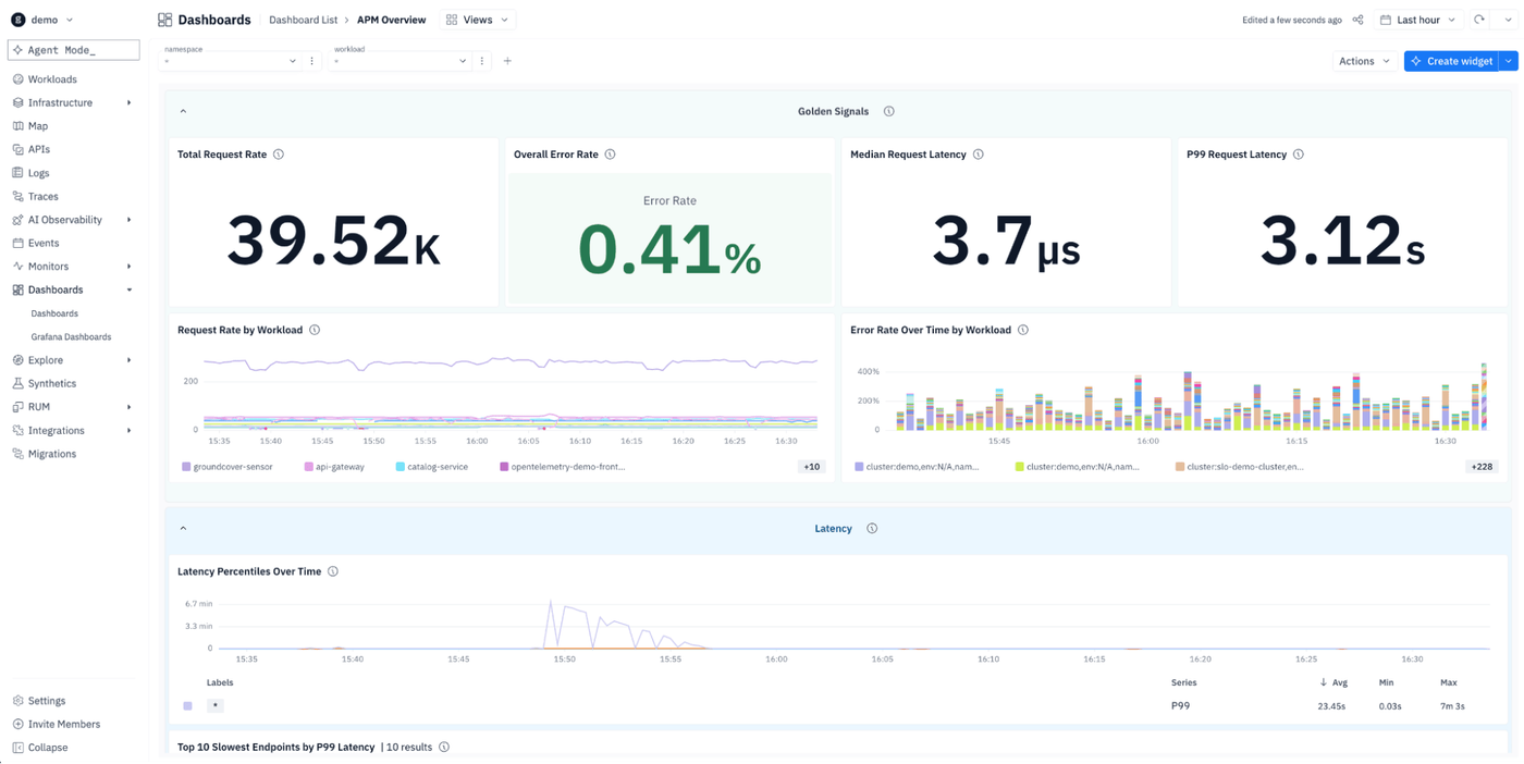
New APM pack
API performance, service detail, gRPC, DNS health, dependencies. Pre-built means an agent, or a person, starts from encoded expertise instead of a blank board.
gcQL
One query language, six data types
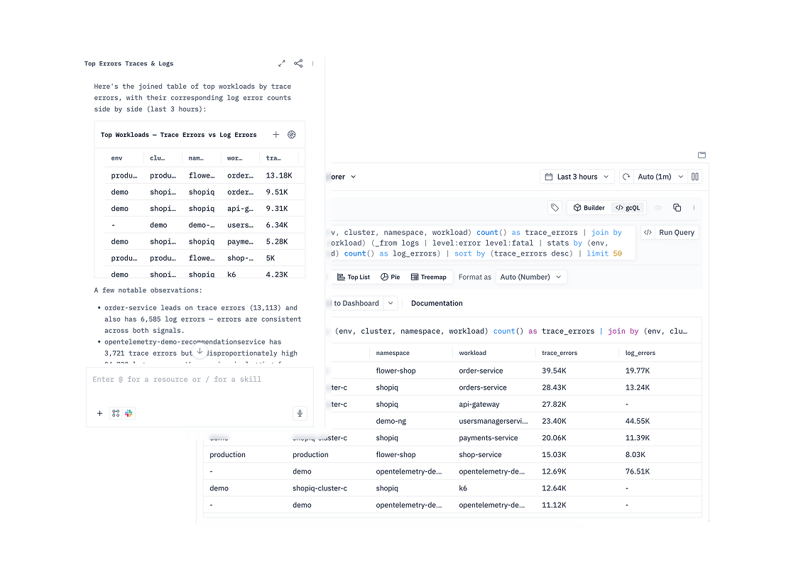
Logs, metrics, traces, events, entities, monitors. No separate query model per type. This is the layer everything above is built on. Every widget on every dashboard is a gcQL query underneath.
The from keyword for cross table queries
One query spans multiple tables instead of a chain of stitched-together lookups.
gcQL code mode in the Monitor Wizard
Write and validate the underlying query directly instead of only working through guided steps.
Multi source joins, grok filter operator, stronger trace search
The connective tissue for correlating signals that used to need separate tools.
What the agent runs, you can read
This is the one that ties gcQL back to the dashboards story. Every query Agent Mode runs is visible, editable, reusable, the same language a human would write. Nothing the agent does under the hood is a black box.
Close
Better primitives, a query layer both humans and agents speak, and a library that actually scales. Dashboards aren’t dead - and now, they’re better.
Hungry for more? Check out Dashboards aren't dead.