Dashboards aren't dead. They help pave the path for custom agents and promote human feedback.
AI agents aren’t replacing dashboards. See how dashboards, observability agents, and human feedback work together to investigate issues, visualize telemetry, and accelerate remediation.


There's a story going around that dashboards are on their way out. The narrative goes like this: agents are so good at investigation now that you'll just ask a question in a chat box and get your answer, and the wall of charts you've been maintaining becomes a relic.
But the story is wrong, and we can prove it with our own backlog. Our customers still open dashboards every day, and they keep asking us to make them better. Request after request for more control, more polish, more precision. If dashboards and charts were dying, that queue would be drying up. We’re seeing the opposite because clear, consistent, unified visualizations are backend work, not just surface polish, and that foundation runs both ways: agents consume it to understand your systems, and leverage it to help you build the next dashboard.
In other words, when agents build visualizations for you they’re helping answer a question with a dashboard or a graph. These visualizations are the byproduct of good questions. They help answer questions and say more than text can. Good visualizations also help promote discussion in third party tools thereby expanding the organizational knowledge base your Agent can access. Meanwhile, the dashboards you build feed the agents back by telling the agent what data and queries matter, so its next answer is sharper. Humans ask good questions, agents make dashboards for humans, humans make dashboards for agents, and each makes the other better.
Like good art, a good dashboard promotes discussion
Before we can talk about how dashboards enable the groundcover Agent, we need to talk about what it can do. Let’s zoom in on the Slack connector for groundcover. Call @groundcover agent to:
- Investigate alerts in Slack with all of your full fidelity telemetry from groundcover in the alert thread alongside other SREs
- Pull o11y data into the thread (including RUM, logs, traces) to dive deeper. Including building Dashboards to visualize what’s happening and prompt discussion.
- Use that conversation in Slack to provide HIL feedback to the agent for subsequent actions.
- Use @groundcover to execute the next steps with approval gates and RBAC for each user who calls it to control data and spend.
However Agent mode in groundcover doesn’t just connect to Slack. It provides first-class connectors to Cursor Cloud Agents, Pylon, GitHub, and Notion, so you get the organizational and code context that root cause analysis actually depends on. Effective RCA, including building the right dashboards and monitors, extends past telemetry data into the tribal knowledge those tools hold. Leveraging the groundcover Agent mode from Slack with @groundcover lets you easily visualize the problem and extend those tools into one place so you can transform a remediation process into a collaborative discussion with your coworkers.
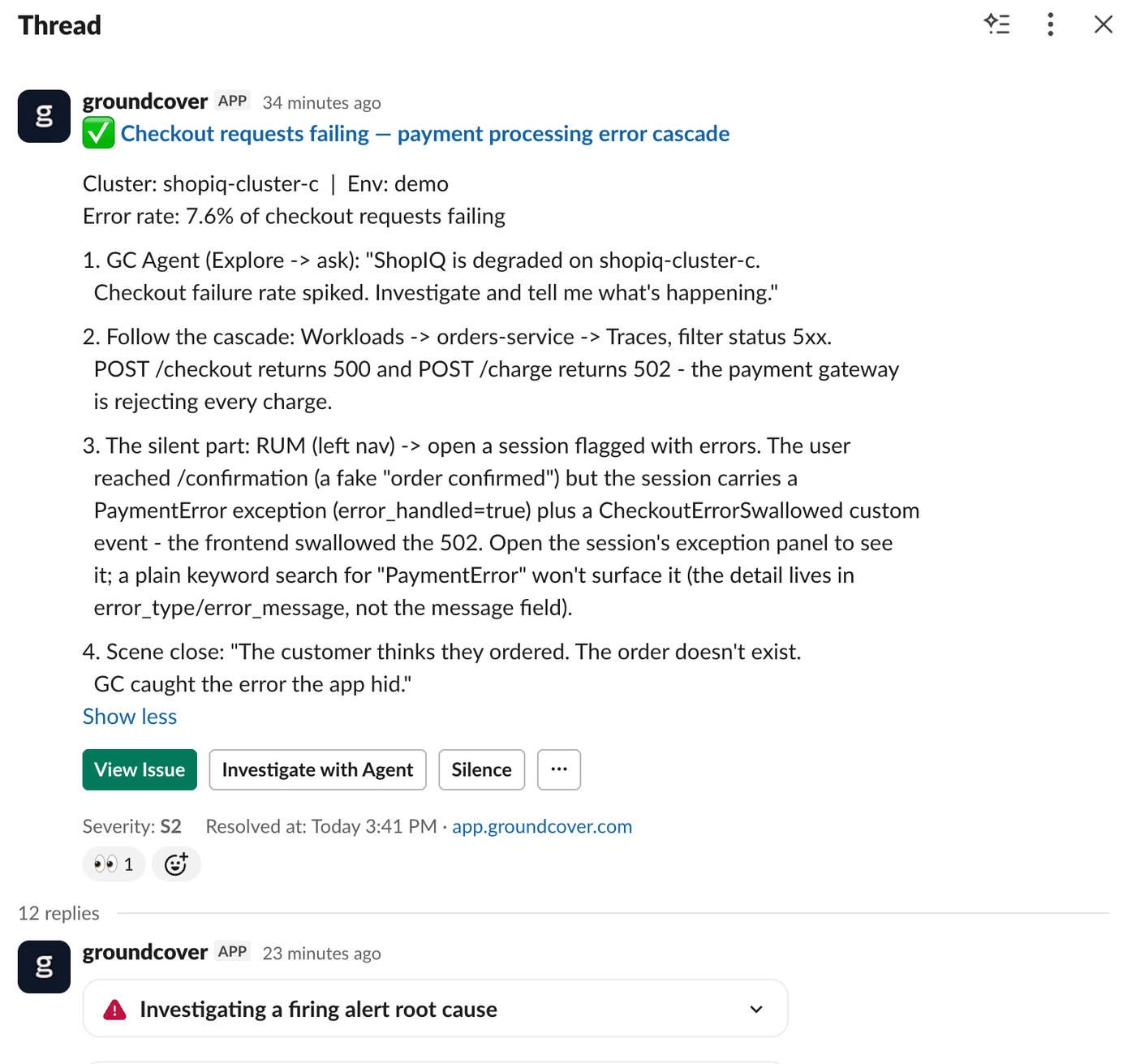
The @groundcover agent even pulls charts and dashboards directly into Slack so that SRE’s can go from root cause analysis to shipping a fix in one spot.
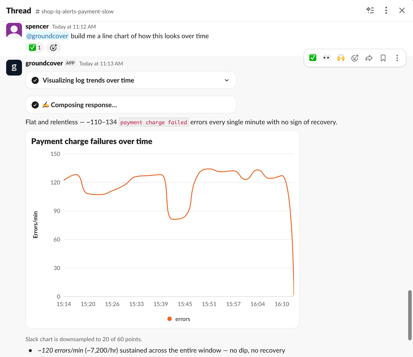
Pulling widgets and dashboards into Slack enables your SRE’s to get more context around what is triggering an alert. Showcasing how the two things everyone frames as rivals turns out to actually feed into each other.
One dashboard for a messy, real stack
Real infrastructure is a pile of tools that all name the same concept differently. One source calls it cluster, another calls it clusterName, a third has its own convention left over from whatever you migrated off of. A dashboard's job is to absorb that mess into one coherent view.
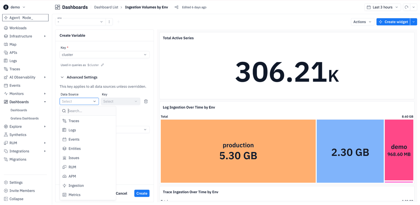
We rebuilt variables around exactly this problem. Custom mapping allows you to create a single $cluster variable which can point at whatever each data source calls that field, resolved per query. The result is having one templated dashboard works across all of the sources instead of forcing you to duplicate panels per source. We see this payoff after a Datadog migration, when you're living with a mix of conventions and none of them line up. Variables also reach across entities, issues, and APM and the setup flow suggests good ones so you're not staring at a blank slate.
This is also where the agent shows up as a friend of the dashboard rather than a replacement for it. When you migrate off another vendor, an agent reads your old dashboards one at a time, understands what each widget was doing, and validates the translated queries against live data. It's not making your dashboards obsolete. It's making them easier to bring with you.
Normalize what you can, map the rest.
Custom mapping is the catch-all, not the first line of defense. Before data ever reaches a dashboard, you can normalize it at the source — and here the agent shows up again, this time upstream. Point it at the mess and it writes parsing rules for you: take whatever a given source emits — clusterName, cluster_id, the leftover convention from three migrations ago — and land it all on one field, one name, at ingest. Fix it once and every dashboard, alert, and query downstream inherits the clean version. You're not translating the same field in ten places; you translated it before it landed.
But you can't normalize everything. Some data is already sitting in storage under the old convention. Some sources you don't own. Some names are too one-off to earn a rule. That's where custom mapping closes the gap. The read-time adapter that catches whatever the ingest-time rules didn't reach. Parsing rules clean the data going forward. These two layers (from write and read) share one goal: a single $cluster that means one thing, no matter how many tools disagree about what to call it.
Prebuilt Dashboards provide a base line for custom agents
The clearest evidence dashboards are load-bearing is how much readability work our users demand. Part of that demand was making dashboard creation an agent first action.
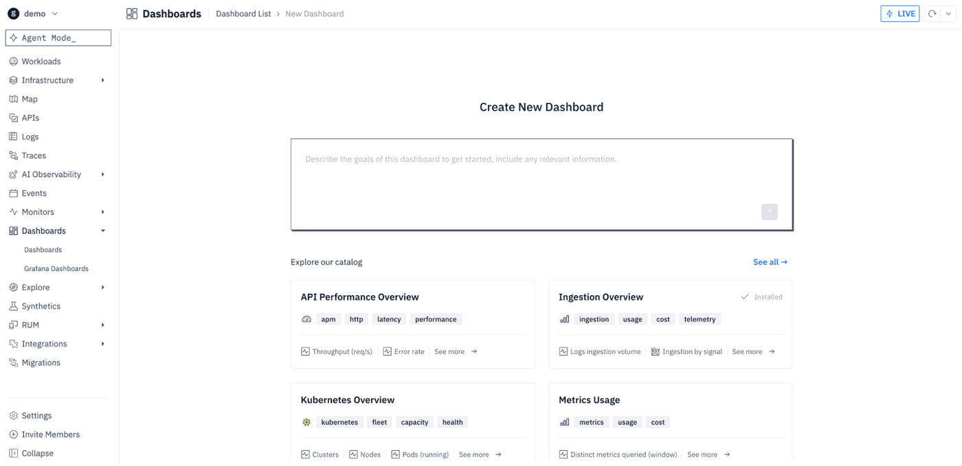
The other part is the dashboard catalog . A dashboard catalog provides encoded expertise. It says, “for this system, these are the signals that matter”. For example the Ingestion Overview dashboard in this new catalog queries for groundcover ingestion at a glance, ingestion by signals and source, and who is driving the ingestion. While the Cost Footprint already queries for where spend goes by service, charge type, and what’s driving cost. This catalog then serves as a curated map of what "normal" and "worth looking at" mean for each domain — which is exactly the context an agent otherwise has to reconstruct from scratch on every investigation.
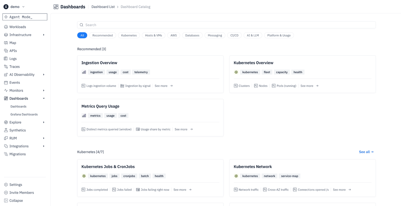
So for a concrete example, say your S3 spend ticks up in Cost Footprint, and around the same time Ingestion Overview shows one workload's volume climbing. Each dashboard has already framed its half of the picture. Now agent mode can connect the two: that workload started emitting far more data last week, which is driving both the ingest spike and the S3 bill. It tells you what the problematic workload is, when the spike started, and what to trim. Again, the dashboards help supply the context while the agent turns it into something actionable. Neither replaces the other. Hopefully the catalog creates inspiration for the types of custom Agent workloads you can start working on, as it provides prebuilt Dashboards for the following categories:
- K8s
- Hosts & VMs
- AWS (including DynamoDB and ElastiCache)
- Databases
- Messaging
- CI/CD
- AI & LLM
- Platform & Usage
The details paint the larger picture
We also continue to ship improvements to dashboards to increase readability and customization. Most of these requests came directly from users and have been added all in the last couple of weeks.
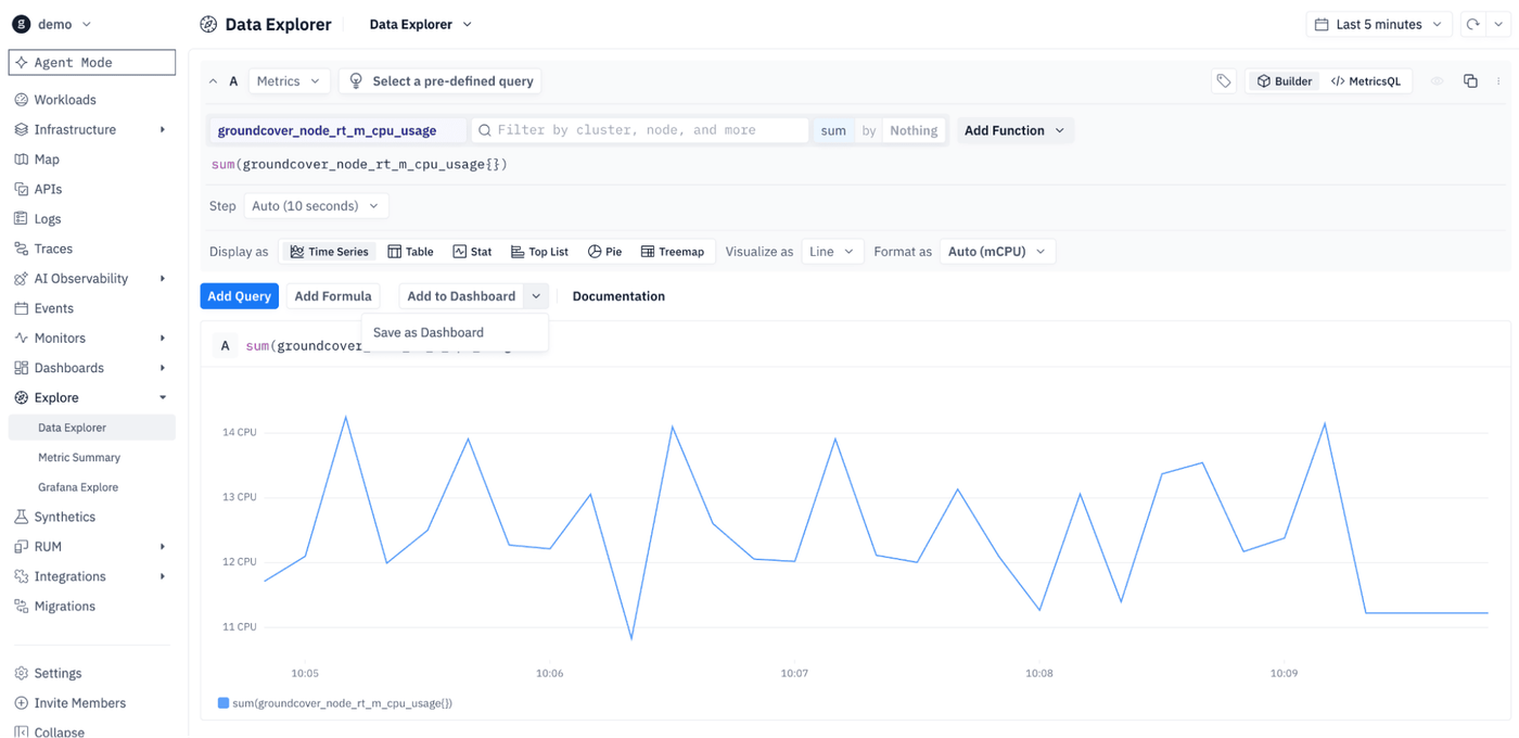
1. Add to Dashboard any query output from the Explore page whether you’ve done the exploration manually or with Agent mode.
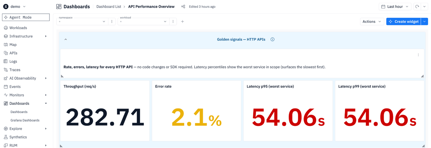
2. A stat tile that just prints a number makes you do the interpreting. So now you can color it by condition — the value turns red the moment it crosses the line you care about, and you read status instead of digits.
3. Apply thresholds to time series to easily detect when your series has crossed a bound.
4. Legends became sortable tables with per-series stats, because when you're staring at forty series you want to know which one is highest without hovering over each.
5. You can set decimal precision, and a tiny non-zero value shows as <0.01 instead of rounding down to a misleading zero. Axes carry their own units and titles, so a chart explains what it's actually measuring.
6. So much there isn’t even time to list it all…so for evidence here’s what our users have been requesting
Small stuff, individually but together it's the difference between a dashboard that describes your observability landscape explicitly and a dashboard that is hard to read. People ask for it because they live in these views, and the friction is real when the chart makes them work to read it.
The agent's job turns out to be better dashboards
Turns out pictures–and data visualizations–are still worth a thousand words. Dashboards actually allow agents to say more and they’re making dashboards more important than ever. A link from @groundcover into a dashboard that summarizes the investigation you performed with the Agent is the fastest way to communicate between teammates around the problem-scape. The conversation around it spawns additional Agent requests like building monitors and alerts on top of those very same dashboards. Dashboards with agents and Slack help you close the development lifecycle in the AI era by incorporating human feedback and communicating effectively. This doesn’t compete with your coding Agents but allows you to perform rich observability that compliments the work you’re doing there.
Where this actually goes
The future isn't dashboards or chat. It's the agent doing the tedious part of actually building the visualizations. That's why the requests keep coming, and it's why we keep building. The commit history says dashboards are very much alive. We're just letting the agent carry more of the weight so humans can continue creative problem solving and focus on big picture decisions.